A lot of the time, maps in schools show Africa as one giant “country.” But in truth, Africa is a huge continent that is far bigger than most people assume. Recent investigations of maps and geographic facts have come back a shocking claim: Africa is so huge that it can easily hold the landmasses of the United States, China, India, and all of Europe, with room to spare. This isn’t just a fun statistic; it shows how ubiquitous globe maps transform the way people think about geography, shift public opinion, and have an impact on economic and political tales about the continent in little ways.
This “true-size-of-Africa” meme is become more popular on social media and other digital platforms. Geographers and instructors are utilizing it as a chance to teach people about scale, power, and how the world is shown. This article discusses about the arithmetic behind the assertion, why maps are often wrong, and what it means to know how big Africa really is in a bigger sense.
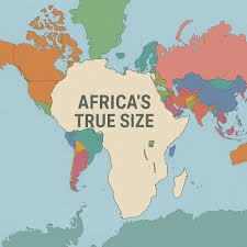
The Proof That Supports the Claim
After Asia, Africa is the second largest continent in the globe. It covers roughly 30.4 million square kilometers (11.7 million square miles) and is about one-fifth of the Earth’s surface area. On the other hand:
– The United States is about 9.8 million square kilometers in size.
– China is around 9.6 million square kilometers in size.
– India is nearly 3.3 million square kilometers big.
– The whole of Europe, including all of its separate countries, is about 10.2 million square kilometers big.
The US, China, India, and Europe together span more than 32.9 million square kilometers. At first glance, this looks bigger than Africa, but the figure that is widely circulated around is based on a slightly more conservative estimate that leaves out several contentious or marginal areas and uses rounded numbers, which gets the total closer to 29–30 million square kilometers. With that new number, Africa’s land can hold all four areas at the same time, plus some extra space that is about the same size as South Africa.
To put it another way, the contiguous United States, the People’s Republic of China, the Republic of India, and all of Europe could fit inside Africa’s borders without overlapping. This is true only if you make some choices about what counts as “Europe” and which overseas territories are not included.
Maps Don’t Tell the Truth About Africa’s Size
The Mercator projection, which has been the most popular style of map in classrooms and atlases for more than 100 years, explains why most people are shocked by this claim. In the 16th century, the Mercator projection was designed to aid people find their way. It makes locations farther from the equator bigger to retain angles and straight-line pathways, which changes the look of the terrain a lot.
On a Mercator map, Greenland looks approximately as big as Africa, but Africa is really around 14 times bigger. On the other hand, countries near the equator, especially those in sub-Saharan Africa, look smaller and more compressed, which makes the continent seem smaller and less important than it really is.
Modern interactive technologies that enable people drag and drop countries onto a globe that is in proportion have been quite useful for correcting mistakes. When people place the outlines of the United States, China, India, and a few European countries on top of Africa, they fit so tightly that there are clear gaps. This reveals how big the continent actually is.
The Size of Africa in the World
Africa looks even bigger than the US, China, India, and Europe when you compare it to other continents and countries.
The continent of Africa is bigger than the combined area of North and South America, which is about 28.5 million square kilometers.
Russia is the biggest country in the world, yet this continent has more than ten times as many people.
Algeria, the Democratic Republic of the Congo, Sudan, Libya, and others are among the eight largest countries in Africa.
The distance from London to Dubai or from New York to Rio de Janeiro is roughly the same as the distance from the north to the south of Africa. From east to west, it is around 7,400 kilometers broad, which is about the same distance as from Boston to Rome or from Beijing to Tehran. Africa is very different in terms of temperature, ecosystems, and people cultures because it is so big. The Atlas Mountains are like the Arctic, the Congo Basin features tropical rainforests, and the Sahara is relatively dry.
Myths, Misunderstandings, and Checking the Facts
People are fascinated in and suspicious of the viral image that suggests “Africa can fit the US, China, India, and Europe.” Some others claim that the exact wording matters: if you count all of Europe’s overseas territories and some locations that are still up for debate, the total area can be a little bigger than Africa’s. Some people argue that the map is more of a drawing than a scale, and that countries have been turned or changed a little to fit neatly inside Africa’s outline.
Most fact-checking groups believe that the core idea is mostly true: Africa’s landmass is big enough to house the continental territories of the US, China, India, and Europe, with some room to spare. It’s not that the meme is mathematically perfect; it’s that it highlights how huge Africa is and how little people know about it.
Why Size Still Matters in the 21st Century
You might expect that geographic errors would go away with computerized globes and satellite photos. But the Mercator-style method of looking at the world still has an impact on laws, investments, and how people see things.
Economic narratives: Maps that make Africa look small and broken up can perpetuate the idea that it is a continent of “many tiny countries” instead of a single, huge economic zone with more than 1.4 billion people and a constantly rising consumer base.
Tourism and investment: More and more, tourism boards and investors are utilizing the “true size of Africa” story to highlight how distinct Africa’s landscapes, climates, and experiences are. They argue that Africa is more diverse than most people think.
Education and cartography: African-born cartographers and teachers are driving campaigns to encourage more schools to employ equal-area projections. They claim that accurate maps are a type of epistemic justice because they fix a visual bias that has made Africa seem less important in world geography for hundreds of years.
An African-born cartographer told a well-known global broadcaster, “We live in a world where size is often linked to power.” People have thought of Africa as little instead of huge for a long time because of distorted maps.
The “Africa-can-fit-the-US-China-India-and-Europe” meme may go from being a popular meme to a regular teaching tool in the next several decades as digital tools make it easier to perceive the world in three dimensions. The goal is not to make Africa seem more important on purpose, but to make sure that people’s ideas match the real geography that traditional map projections have been hiding for a long time.
Africa’s True Scale: How One Continent Can Hold the US, China, India, and Europe Together